Ready for another thing that makes me cringe? I mean, are you really? I feel like you might be over it. OK - here goes.
A CHART-TOPPING CRINGE WORTHY ELEMENT: SHITTY SINGLE, EP, OR ALBUM ARTWORK.
Don’t have crappy artwork. Just don’t. These days, there is literally no excuse.
This is the presentation of your music and your brand -- you can’t afford for it to look anything less than professional. There are free platforms to create graphics, smartphones that take amazing photos, and plenty of resources for inspiration. You don’t need a graphic designer unless you have a crazy idea that you can’t execute OR you are fortunate to have it in your budget.
Here are a few guidelines that we tend to put in place for all of our releases:
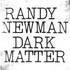
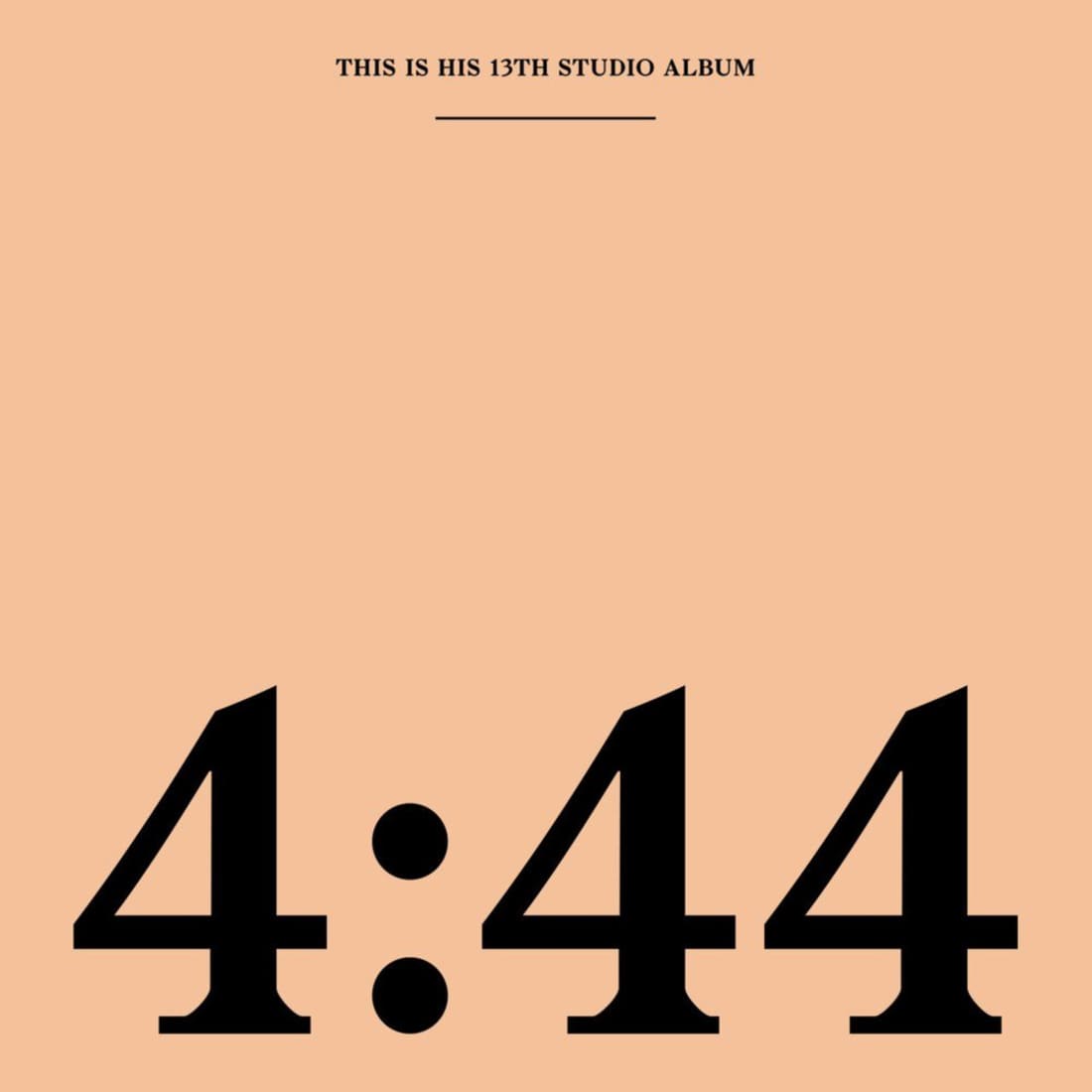
Keep it simple. If you can’t execute something dramatically visually engaging, strip it back to a plain background with text. This is often is very impactful on its own.
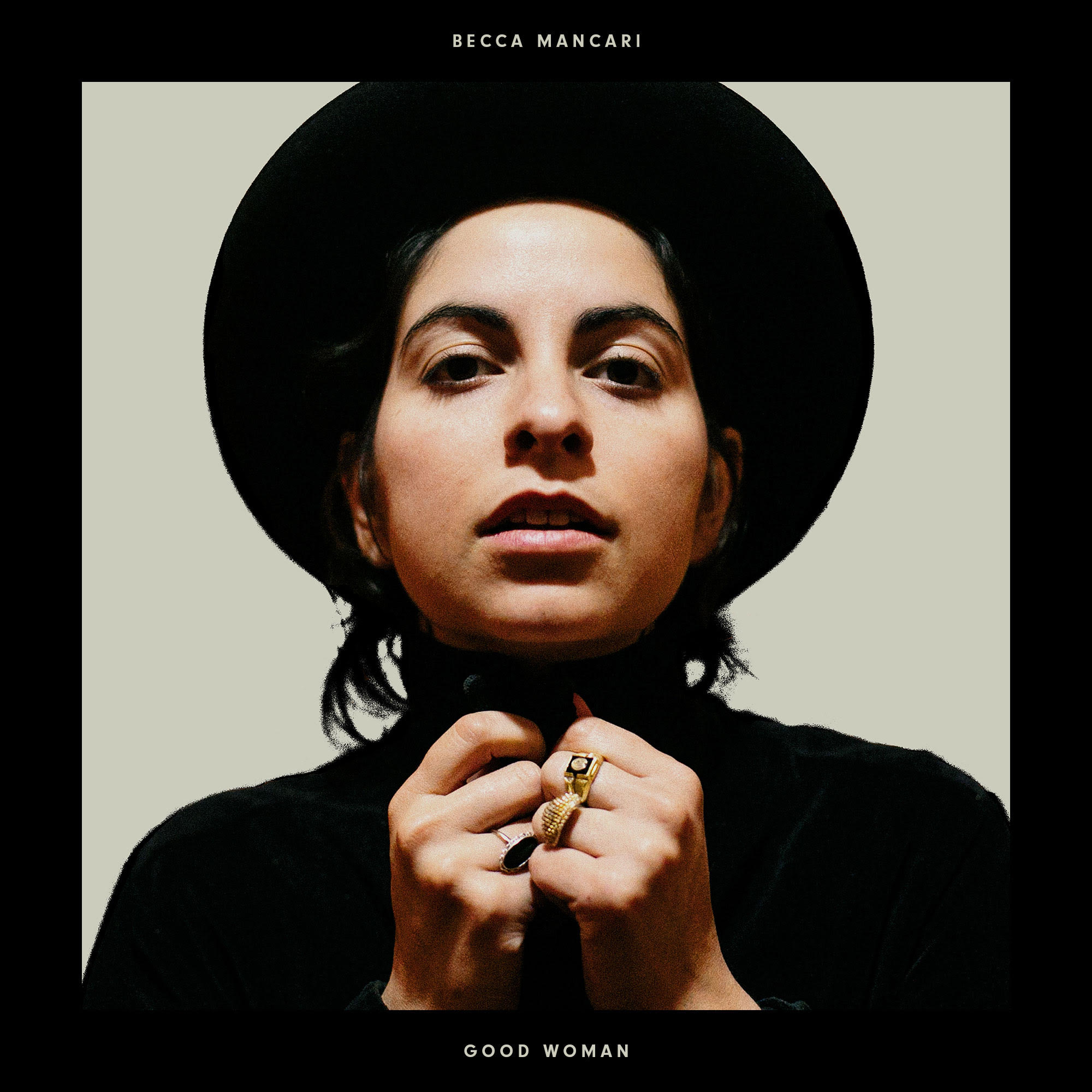
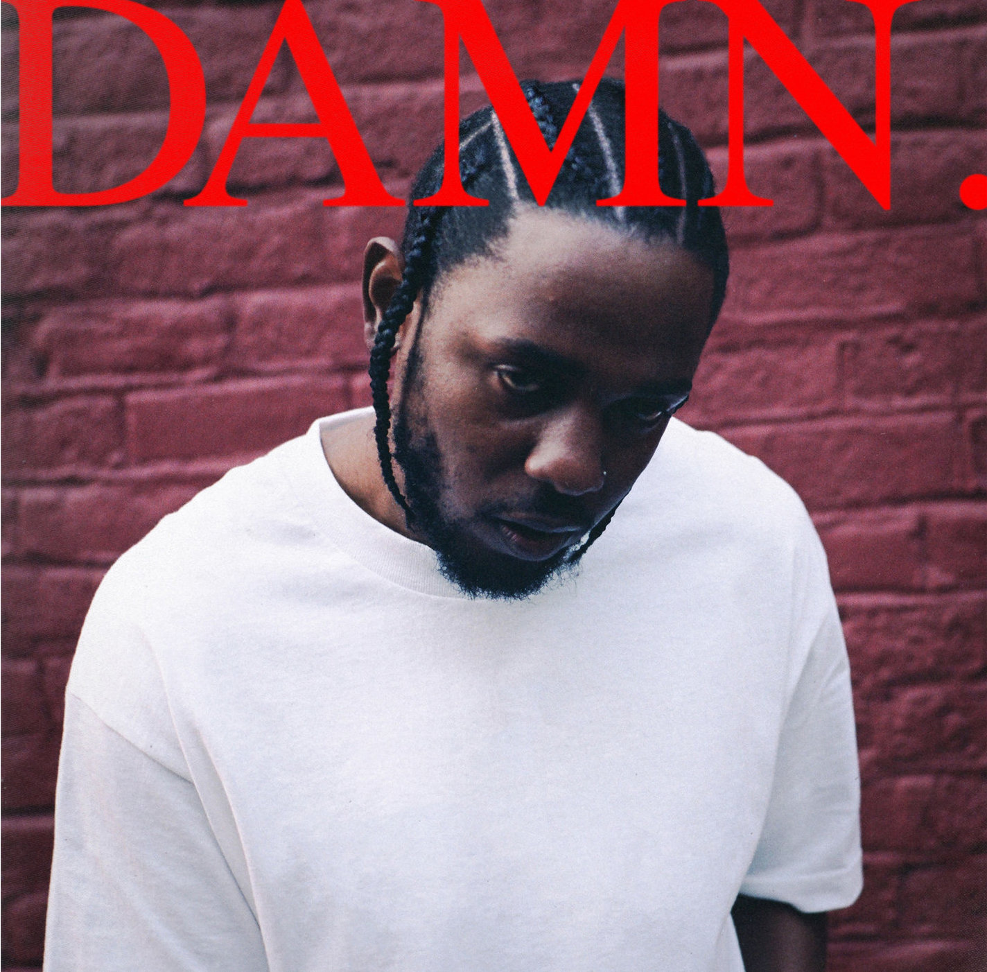
Toss the idea that you have to put your face on every single/EP/album that you release. Some artists can’t get away from this notion and their discography ends up looking like a visual history of their various hairstyles. If you are going to use a photo of yourself or band make sure it’s different from your press photo. Also, keep text simple and straightforward.
Book one photo session that captures press photos, album art, and landscape visuals that work with your branding. This way, all photos match and play well together.
Work with art that has already been created. You must clear it with (and often pay) the creator, but most visual artists are up for an agreement like this.
Consistency between releases. If you are planning a slow rollout of singles leading up to an EP or album, make sure that you have a well thought out plan for how to execute the visual imagery. You definitely don’t want these singles to end up looking like stand alone releases (unless they are). If it’s tied into an album, keep the visuals the same.
Keep in mind that most people will only even see this as a thumbnail. In the new world of streaming, artwork has gotten less complex to make up for the fact that most people will just see it on their phone.
At the end of the day, this is all a part of that pesky branding thing I keep bringing up. You’ve got to present a cohesive and professional product into the market place, or you may get lost in the noise.
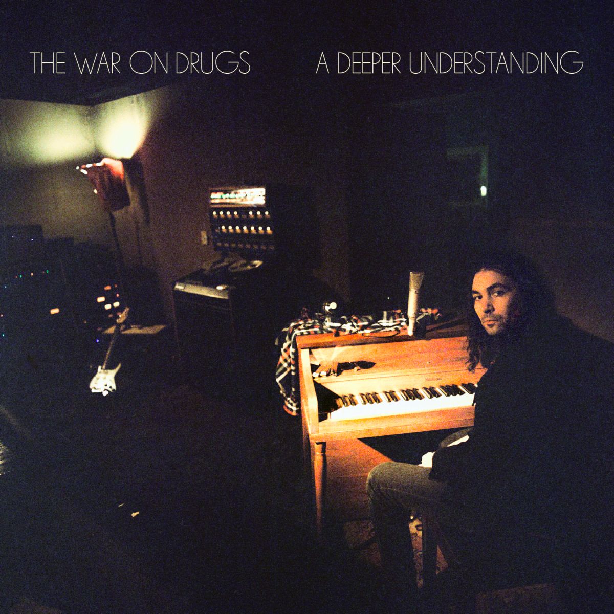
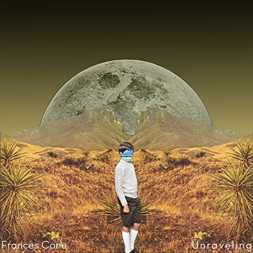
Here are some of my favorite examples from the past year (I'm not using our artwork, but duh, I like all of those). For this post's purpose, I am exclusively using examples that the DIY artist could execute on their own. I definitely love some releases that have more involved artwork and utilized a professional, but my main point is that it's not 100% necessary. Here we go:
[SIMPLE]
[USING YOUR FACE]
[USING OTHER ARTISTS]
[GREAT USE OF A SMALL SPACE]
REASON TO IGNORE THIS ADVICE: I’m not sure why anyone would strive for shitty artwork, but honestly it looks like that’s what some people do. Enlighten me, please!


